Paperless Post is a paperless card company. They provided me with coins in exchange for my thoughts, so here we are.

At a glance, Paperless Post looks like another site for e-cards, but I’m not thinking like that with them. I’m not a fan of e-cards, because the designs oftentimes look cheap, animations working not in their favor, but when I browsed around the Paperless Post website, I was impressed. The designs don’t look cheap. I’m in love with a ton of them. I’m still impressed.
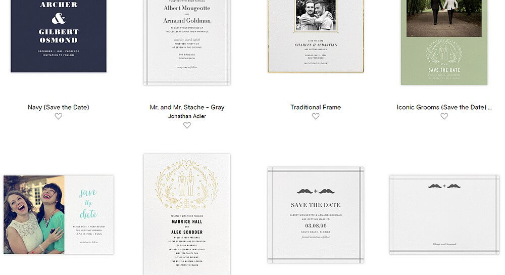
Then I saw this:

Dun, dun, dun…
And I was smitten. 😍 Obviously. 💁♀️
Designing the card 🐳
I designed a birthday invite for myself. I’ve always wanted to plan my own birthday party, so hello, hello.~ 😏 Don’t mind if I do.
The whales party design appealed to me most, and then I realized that my hypothetical birthday party could totally be at the Dallas World Aquarium Zoo, my favorite zoo, so I like to think that this was meant to be.
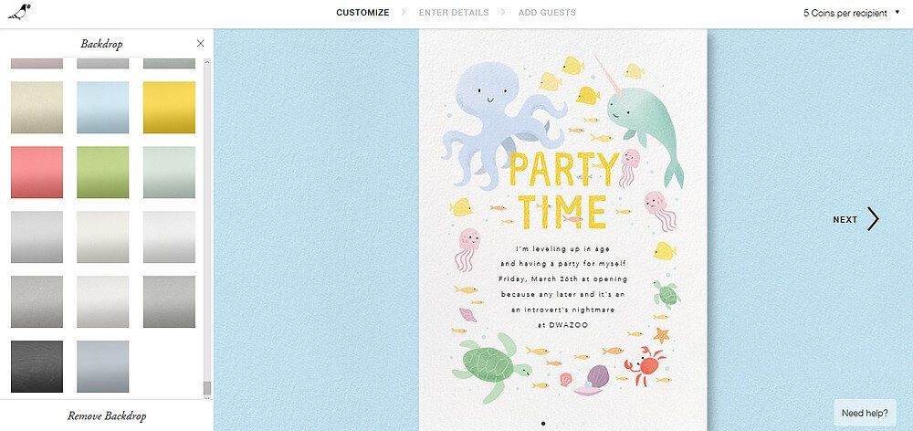
First up is finding a backdrop. I initially chose Cold Press – Mustard, but settled on Cold Press – Harbor. Mustard was a bit too bright for my eyes to handle/work with long-term. I do wish there was a search box so I could have searched for specific themes/colors instead of having to hit “Load more” and go through all of them.
Second was the text. It says:
I’m leveling up in age
and having a party for myself
Friday, March 26 at opening,
because any later and it’s
an introvert’s nightmare
at DWAZOO.
…I edited typos after the screenshots. 😳
Designing the outside (envelope)
I decided to stick with the cute marine life liner. 🐠
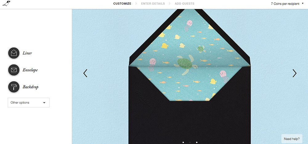
Even though I chose a different envelope, the preview still showed another one. I can only imagine it was a glitch in the process, but when I went to choose a stamp, the envelope I am actually going with is shown. I did check to see whether drafts can be saved, and this looks possible, but it was not automatically saved. I was nervous for this, which is why I didn’t refresh; I didn’t want to lose all that I’ve put into this already. If I had both hands functioning well, it wouldn’t be a big deal for me, but because I don’t, going through the process of typing it all out again is a bit more than I have patience to put up with.
I think perhaps the issue wound up being that I was not actually signed in, even though I authenticated via Google. I think, in having an account, you need to actually create a password so you can use the site to the fullest, instead of just authenticating via Google or Facebook. After signing in properly, I didn’t experience this issue anymore and could go back to edit the card sans preview issues.
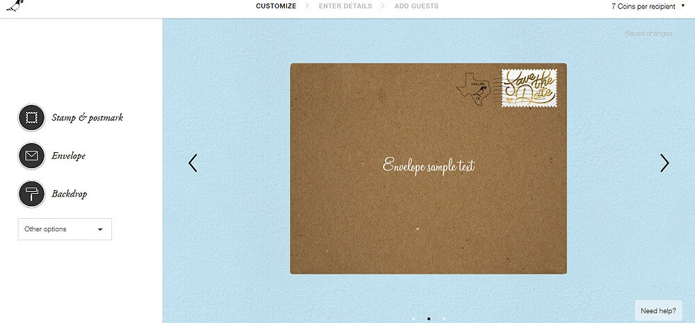
The envelope contains a “Save the date” stamp because my family is so adamant about my finding a man and getting married that I obviously have to mess with them in my hypothetical birthday party invitation planning madness. 😏 I mean, who would I be, right? The saying is that a plastic ring from a cupcake is the closest I’m getting to a wedding of my own. 🤦♀️ This is the closest they’re getting to a “Save the date!” from me, because I’m not having a wedding; I’m eloping. 🤷♀️ Joke’s on them. 🤣
The postmark is also customizable! For this example, I used an outline of Texas with the Paperless Post bird. If I was really sending out invites, I would use one that said “Paperless Post” on it, because I would rather get cards from here than the other sites they send them from, and I totally try to build brand rec with my family. I’m so bad. 😅 They’re just prettier at Paperless Post.
The font for the envelope’s text is Monterey. I did want to use Ondise, but it’s a bit too small for my taste, and there’s no option to resize. I don’t feel a loss, however, because I really like Monterey.
Reply card
Ah, more options! How cool is this?
There are a few options:
- Invitation with RSVP
- Greeting Card
- Save the Date
- Announcement
- Card with Website Link
I’m just going with the first one, because that seems easier and I’m too lazy to setup a website for a party (also, the page for the guests is set up in a way that doesn’t require a separate website for info).
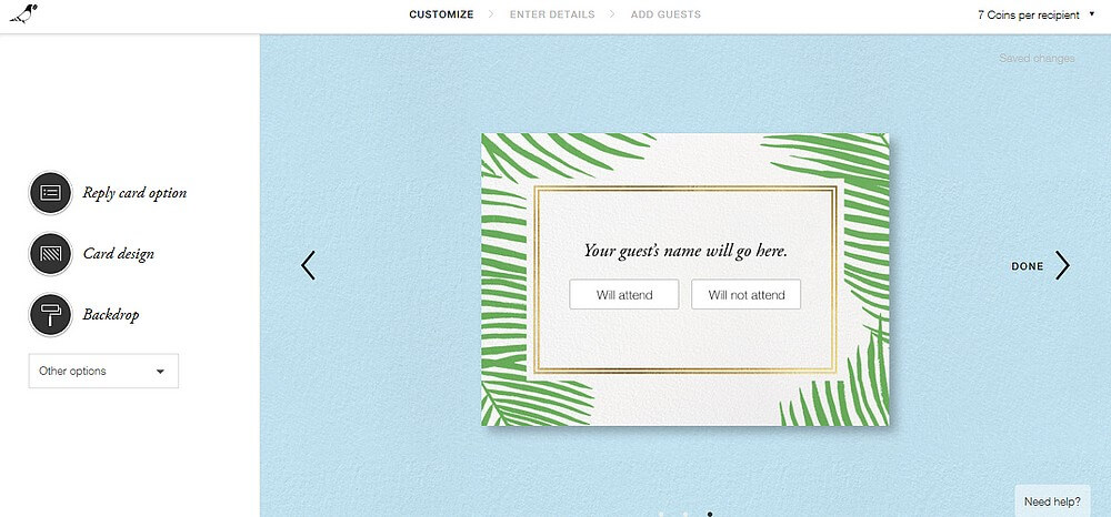
My reply card uses Palmier Nouveau (Response) for the design. DWAZOO is more than just a zoo with oceanic exhibits; it’s an experience. The green leaves symbolize the part wherein you walk through the rainforest exhibit (which is literally a rainforest).
Cost 💰
Paperless Post has its own currency (coins), which you use to send cards. I surmise it varies based on what you’re sending out, but I did notice on my Account Settings page the opportunity to earn 10 extra coins if you’ve got a Facebook account and another 10 if you install their Apple app.
The breakdown of my card:
- 2 coins for a premium card
- 1 coin each for backdrop, envelope, liner, specialty stamp, premium response card
It’s a total of 7 coins. I’m not into big parties, but DWAZOO’s party discount is for a group minimum of fifteen people. I would need 105 coins total, which would come out to about $20 for 100 coins and the remaining 5 could be bonus coin rewards (for example, but it’s not like I wouldn’t use them up eventually…).
Overall thoughts 🤔
I think Paperless Post is super cute. 😊 It feels weird to say that, because they have elegant designs also. I love paper cards and they’ll be relevant as long as people are into them, but even I hoard all the ones I’ve received and do not do much else with them.
Before, I was against e-cards myself because all the ones I’ve been sent have felt cheap. Technology removes a lot of limitations physical cards have, paving a path for all the bells and whistles anyone could ever think up. The process is fun for the person, but the end result is a mess. The experience of opening those cards aren’t so great, either.
Paperless Post, however, offers one of my favorite things when it comes to brands: an experience. They’ve found a way to merge the traditional experience of paper cards with the many options paperless cards have to offer, but in a way that is still classy and adheres to traditional paper cards. Whereas I would have to design my cards envelopes or hire someone to do it for me at a much greater expense (including time), I get to express my creativity by not only choosing a card and writing my own text, but by picking out the envelope color, the envelope liner, the designs of additional cards, the fonts, and the backdrop. My favorite part about the guest process is the page they’re sent to to “open” the invite, plus the ability for me to add a gift registry; I think that feature is amazing!
Price-wise, I’m surprised at how inexpensive it is, but I’m also pretty amazed? I buy a lot of cards. Like, a lot of cards. It’s an addiction. I don’t buy super fancy designer cards, however, because per each they run at about $5 a pop, and that adds up fast. The design is quite similar to what I just outlined in this post, but I favor more the experience of it all.
Paperless Post also offers options on the invitation page, like reservations and the ability to add a gift registry. It does all this work for you, so you can relax and don’t have to keep track in a hundred different apps.
Last, but most definitely not least, I discovered a [promotional] feature that I don’t see often, and it deserves recognition. Instead of partaking in the “hide the gays” trope, they totally don’t. Nope, nope, nope. It’s a WHOLE THING. 👩❤️💋👩 🌈 👨❤️👨
Love this post?
Support me by subscribing to my blog and/or buying me a cuppa:
Leave a comment