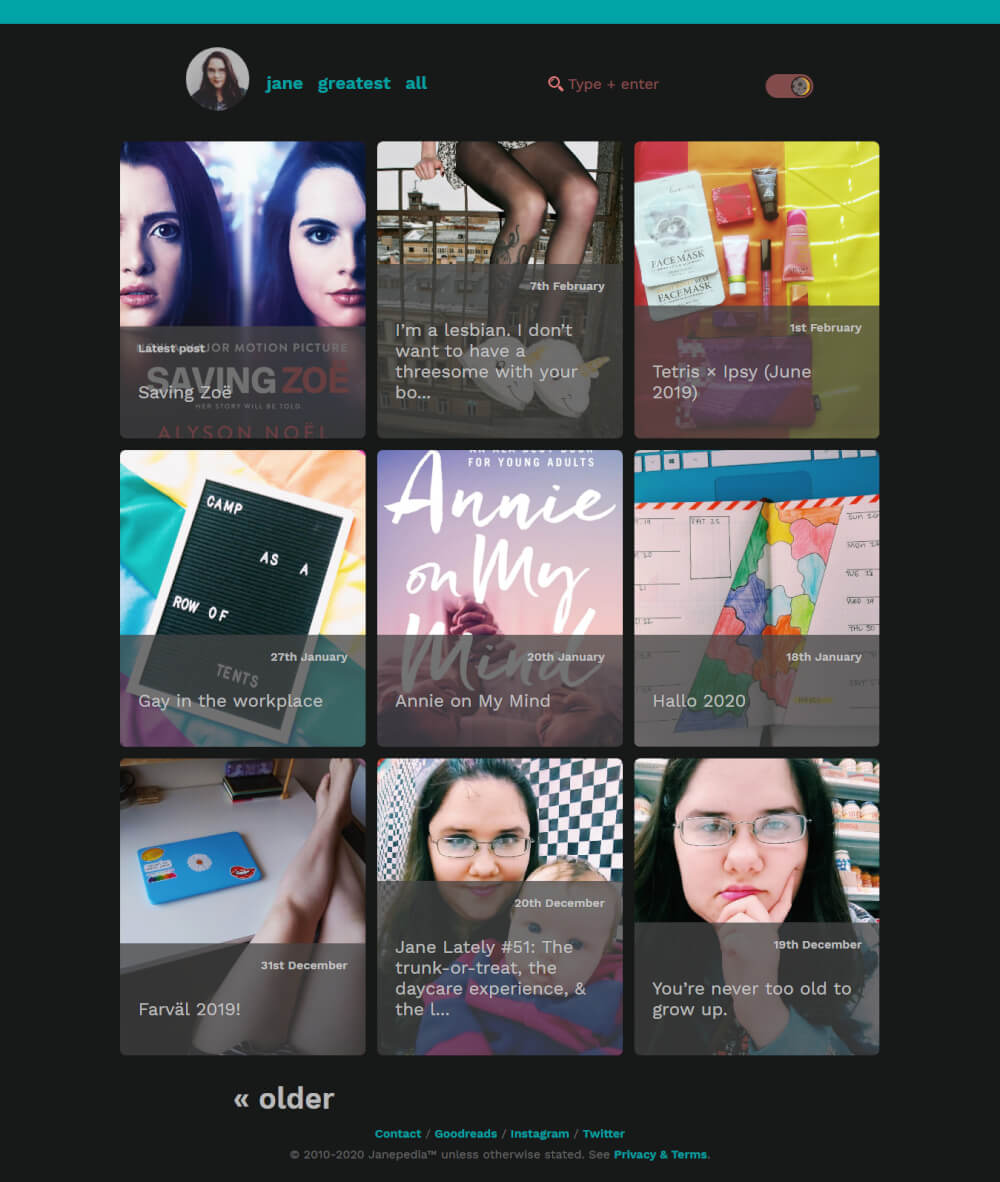
I redesigned my blog again. My near-death experience (NDE) changed me in a way that that theme didn’t work anymore. While I didn’t see my life flash before me in an instant, the aftermath flooded me with the realization that I could have died and left behind a false legacy.
It’s a long story, but the gist is that I don’t want to be remembered as a straight girl or go down in history with my current legal name being the last legal name before my death, because that’s just not me.
And there’s nothing quite like feeling your heart switch places with your stomach to confirm for yourself that what the people around you think is a phase or a “fake” part of you is anything but.
teal menace was a blatant metaphor for what a personal blog is: the innards of its author. I thought it was clever, deep and meaningful. I still do. Under a different light — perhaps sans an NDE — it would have been perfect for a longer duration than a few months. But alas, life did not happen that way.
The flaws of v1.0
I lacked adequate fallbacks for Microsoft Edge (and other browsers), which I can’t personally test because my PC is low on disk space because Windows 10 is pure shit.
The skewed elements inevitably did things I couldn’t figure out how to control and had zero patience to adjust.
I loved the ul and blockquote styling, and the first-letter class that made the first letter to certain paragraphs bigger. I took these things I liked and made them work with teal venus (let’s call it venus for short).
Major & subtle diffs

- No skewed elements:
border-toponhtmlelement, rather than header having skewed::afterpseudo-element; no background (thus no skew) on footer - Social media icons are in footer instead of header, so they’re a bit more out of the way. I wanted the top/main menu not to be crowded and just get to the point.
- I coded this theme better, so if I do need to make adjustments down the line it will be easier. I essentially used the same template files, but started over on the CSS.
- Body text is not as large as previous size; I found it was not proportional to everything else and made my writing style appear long-winded.
- New, unique-to-me-and-my-brand 404 page.
- Color scheme is now mainly turquoise and green. The subtle difference between teal and turquoise often confuses me; I like saying “teal” because it sounds weird and is easy to say, but turquoise is more my cup of tea.
- Dark mode color scheme is turquoise and coral.

- Images bleed out of parent container, both on smaller screens (completely to edges) and larger screens (to an extent). I intend to do this with embedded videos as well.
- Special interactive features (e.g. color palette, displayed below)
Color scheme
I felt changing the color scheme was necessary to accomplish what I wanted with the light mode, dark mode, and theme overall.
We all have slightly different versions of ourselves. Collectively, they make us who we are. I wear a lot of pink to work — purple lipstick beneath metallic purple lip gloss, which appears more red violet; the pink patterned LulaRoe Irma tunic that I just love the fit of. I only have three work-appropriate shirts; everything else advertises a brand or is more along the lines of lounge wear or something that would catch on the pegs (not that my work vest doesn’t do that enough).
Simplicity was the goal.
The intention was to create a theme I could build on as I learned more things.
The issue I ran into with the initial version was the inability to keep up with the mess I created. Basically, I found loopholes to get what I wanted and never went back to fix them like I’d planned. This time around, I opted out of the loopholes and maintained an organized structure.
It’s simple right now, but there’s plenty opportunity for me to implement more complex bells and whistles down the line. So it works for me, for now.
Intended adjustments
- Header menu navigation gets weird on smaller screens at this tims
- Post listing card meta transition: I wanted it to slide up from the bottom on hover, but couldn’t achieve it with my current knowledge and time
<ul>and<ol>margins
Love this post?
Support me by subscribing to my blog and/or buying me a cuppa:
Leave a comment