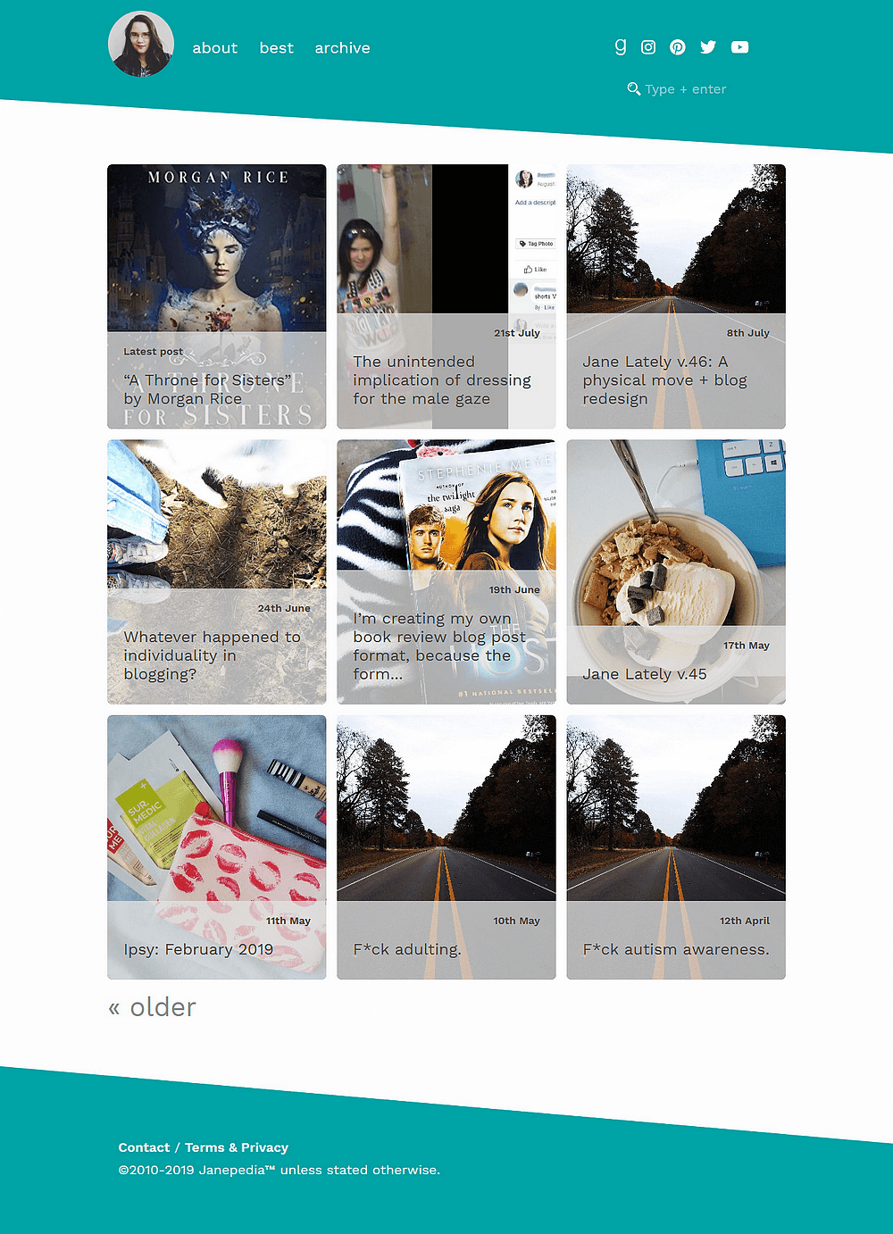
I wish I had a more insightful anecdote to explain this redesign, but I do not. Truth is, I was tired of coming up with excerpts and wanted more visuals. My blog writing has changed since Georgie designed Mercury, so as much as I still love that theme, I kept running into places where it wouldn’t work well for how I blog now.
Inspiration for teal menace comes from all over. My style is eclectic. Typography, visuals, and overall design were developed from a particular need I’ll have come 2021, when I hope to publish as a blog series a memoir/collection of personal essays pertaining to me, myself and I. The desire to play with other mediums, including video, also created in me a fury for Janepedia to focus on that — and all which makes me me.
In other words, it’s a motherf*cking tribute to myself.
But I also consider the influences (including people) around me as imbued in most everything I do. So that’s why you’ll see specks of these influences (including Georgie, Kassy, and C.G. Drews).
Perhaps the largest reason I wanted thumbnails on the index page, aside from being so annoyed at writing excerpts, is because I’ve realized I’ve been hiding behind just words. After taking hardly any photos of my face for nearly half a decade, I’m back to selfies. I’m tired masking myself beneath the words, especially first-person point of view doesn’t help to illustrate other things, like mannerisms and facial expressions.
All in all, it’s been almost three years since my blog’s previous redesign.
Plus, symbolism:
I include it everything, so I guess I’ve some explaining to do, right? At a glance, the most obvious design elements (skewed header and footer) look innocent.

It’s a — trigger warning, by the way — reference to opening a wound. I’ve shared my experience with self-harm via self-mutilation, and…this is where the inspiration for skewing originates. I’ll let your imagination sort out the remaining symbolism there because it gets even more morbid.
Secondarily, it’s a reference to my dissociative identity disorder (DID). Hollywood romanticizes DID, formerly known as multiple personality disorder, as “split personality” when it’s literally the complete opposite of what’s happening. Worse, it is thus idealized as “split personality” by the media, so stigma is particularly horrendous and hard to combat.
So, for all intents and purposes: I, along with my alters, designed this theme. I, Jane, am the collective system — I’ll get to that in a later post, at a later time.
The point is, as with opening a wound, my blog essentially provides a view of my innards through a hole in my body.
I just made it all much prettier, quite poetic, and way less grotesque than if you did that in reality.
Inspiration for this originates from Taylor Swift’s “I Did Something Bad”, “Look What You Made Me Do”, “Delicate”, and “…Ready for It?” — plus lots of Halsey songs, but especially “Nightmare”.
The name is a pun.
In short, “lavender menace” is an anti-lesbian phrase coined by a woman who thought lesbian issues were irrelevant to the feminist movement. teal menace is lowercase for irony, because how can lowercase be so menacing? The last <p> — although I can’t for the life of me get WordPress to stop wrapping images in <p> — instance is a teal heart (or emoji heart, depending on your browser/computer settings — for the same purpose.
I have grown to like lavender. I’m no longer bothered by purple being my mom’s favorite color. I love lavender things, from scents to bath products to the actual flower, so I wanted to work it in somehow.
If the dark pink used for links are too hard to see, I’ll eventually reverse the dark pink and lavender (hover) instead.
While teal is not part of the lesbian pride flag, I used it for reference regarding a color scheme. I didn’t want a palette using precisely the colors of the flag, but I did want to allude to it.
Boundary play
I think outside the box, live outside the box, don’t fit into any box…so I wanted to illustrate that, at the same time respecting boundaries.
- Post images stay in container
- Page images aligned in the center stretch outside it
- Depending on screen size, images stretch to full-width.
<ul> and <blockquote> are not blatantly styled.
Rather, they look like inline styling (which I frown upon for numerous reasons). I think the biggest reason a lot of bloggers still rely on inline styling is because they don’t know they can achieve the results they want by editing actual CSS, or using Jetpack’s handy CSS Editor.
It’d be role-model-worthy if that’s why I styled <blockquote> in a gradient and <ul> the way I did, but that’s not why I did it — it’s just a bonus, like, Hey, look at what you can do with CSS! SO much better than inline style.
But, alas, I just did it because I wanted to. As I told my ex-girlfriend, I do what I want.~
Easter eggs, references & other sh*t
- Pages are excluded from search results; if search query returns one post, user is redirected to that post.
.first-letterclass does cool things because I’m a writer & it’s specifically intended for aforementioned memoir/series, but obviously I’mma be using it for other things 👌
Error page
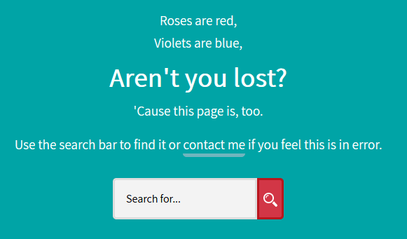
I copied 404.php from Mercury, changed a color and the font, used a background data image for the submit button instead of <svg>, and added a rotating message. My favorite is about reusable menstrual products. My second favorite is poetry, by moi.

Roses are red,
Violets are blue,
Aren’t you lost?
‘Cause this page is, too.
I feel super clever over this poem, you don’t even know.
Anyway, I was super lazy with the error page and will tweak it later.
There are lots of other minor details, but as a writer, I like leaving things to the audience’s interpretation — so that’s what I’ll do here.
Bugs & feedback
I’m totally interested in constructive feedback and bug reports. I’m sure there are bugs I haven’t caught and oddities that should be fixed, so just drop any you find in the comments & I’ll get on that ASAP.
A dark mode will come soon, but probz not soon enough?? Because I’m moving, really need to get s/c up, and busy doing lots of other things. It’s the first thing I added to my food blog, but my finger joints ache from coding for almost 18 hours straight (don’t ask).
- Safari ish (info)
Default Gravatar URL(8/5)Index page card info backgrounds was a more jaded shade of(7/30)#fff, but I changed it torgba(254,254,254)for [hopefully] better readability.
Love this post?
Support me by subscribing to my blog and/or buying me a cuppa:
Comments on this post
Terin
Jane,
Have I told you, lately, how refreshing it is to read your posts?
I love the theme. Thank you for including the screenshot of what it is supposed to look like, because it does not show in Safari. However, it looks great in Chrome.
In Safari, the teal header and footer are regular boxes…or maybe they are a bit slanted??? But not as much as your intended design.
You’ve done some great work, and I think it really suits who you’ve become as a person. Thank you for sharing your inspiration.
Louise
It looks really great! Well done. I haven’t encountered any bugs, but I will let you know if I do.
I wish I could develop theme for my own websites. I mean, I know how – It’s just that I lack the time and desire. (Since I spend all day making WordPress websites in my day job.)
Leave a comment